
Here are some things that relate to what we do in the world of elearning.
Build Consistent Navigation
People generally expect that things work the way they expect them to. Navigation is one of those types of things.- Don’t deviate from what people expect. Navigation should be consistent. Generally people look over the screen using a Z or F pattern. It makes sense that the back and forward navigation is at the bottom right corner since it isn’t critical information and one of the last things we need to see on that screen.
- If you do deviate from expected norms, have a reason to do so. Don’t just haphazardly move things around the screen. I’ve seen buttons turned sideways and in different places just because there was no room on the slide or the designer wanted it to look different. This is a frustrating experience. When people start focusing on the navigation and not the instructional content, you’ve probably failed.
Use White Space in Graphic Design
White space is a just as much a design feature as any other graphic. However, I think some people aren’t comfortable with it on the screen. Empty space is like a vacuum that will keep sucking until it gets filled…kind of like my hallway closet or kitchen drawers. Typically we’ll move objects around to fill the space or add decorative graphics.I worked on a project once where we had icons for six modules. The way they were designed they didn’t completely fill the top. So we had an empty corner (which was fine). But our client couldn’t handle the blank spot and didn’t want to change the icons. So she had us build an extra module just to fill the space.
Don’t be afraid of white space. It’s an ally when communicating visually. Here’s a good article on white space in graphics.
Change Isn’t Easy
It’s hard to institute change. That’s what Google ran into. While trying to persuade change can be frustrating there is something valuable in the process.If change were easy we’d do it all the time and probably mess up more than we fix. The fact that we run into walls and roadblocks requires that we step back and assess the value of continuing versus the benefits of change.
How much effort are you really willing to put into the change? At one point is it not worth it. If it’s important you’ll find a way to get the change implemented. If not, then give up and spend your time and energy on things that will produce better value.
Compromise Can Make You Seem Indecisive
I’ve worked on projects where after a few meetings we ended up with three or four decent ideas instead of one good one. The team would split into different camps and support different ideas. Since they were all good enough ideas and we generally didn’t want to offend others (or seem overly aggressive pushing ours) we’d present all of the ideas to our clients and let them decide.That’s probably what the Google designers did.
This is a lack of leadership. Instead, tell me which one is best and why?
They presented then-CEO Eric Schmidt and other leaders with a set of four different concepts, with themes like making Google more like desktop clients, or differentiating products by color. It sounded like there were too many options and not enough conviction.
Clients hire you for your expertise. They don’t want to make all of the decisions. In the Google example it looked like they presented too many choices and the lack of clarity made it seem no one was really convinced that one was better than the other.
- Options are good. You should present options to your clients. But there should be a reason why you’re presenting them. Perhaps each option addresses a slightly different strategic perspective. For example: choose A if you want to go this route. Choose B if you want to go the other. Don’t make both options an A.
- Present Multiple Treatments. Generally I present three treatments that range from least expensive (basic) to more expensive (most interactive and media intensive). Each choice is a little different and presents pros and cons for each approach. This gives the client some flexibility with a reason for doing so.
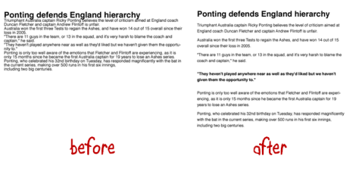
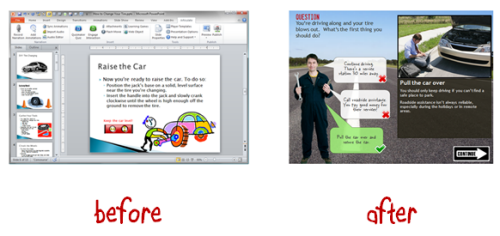
Before and After Examples Work
Instead of wasting your time trying to explain what you want to do, build some before and after examples to show your clients. Seeing the difference is better than hearing about it.If you work in a large organization building the same boring click-and-read content and want to do more, then take that boring content and rework it to show what you want to do. Show them the difference between good and bad elearning.
Stay Connected with Your Peers
When the initial presentation didn’t work, the Google designers became more strategic by staying connected with each other. This is something you can do, too.Many times the training and elearning people are spread throughout the organization and not usually connected to each other. But there’s a lot of power in being connected. In Google’s example, they were able to coordinate some of their design ideas.
I presented to the Humana group in Kentucky. They’re connected and run an internal training conference every year. It’s about as good as any other conference I’ve been to (on a smaller scale). This lets them create a sense of community and ability to share all sorts of expertise. Another group I met with the Washington State government has started doing the same thing by connecting their elearning developers. They share best practices and resources.
If you work for a large organization, see what you can do to connect with your peers. If you need some ideas, let me know. If you don’t have access to others in your organization then join the elearning community and use that as your community of peers.
Doing some regular networking is good, but it doesn’t need to be that organized. Just jump into the community when you need some specific help with your elearning projects like how to streamline the content and create a great elearning course.
The article about the Google designer’s is a reminder that working on teams and trying to make change happen can be a challenge. It’s true for Google and it’s true for elearning.
Hopefully these ideas help you move in the right direction. Did you gain any other insights from reading the article about Google’s designers? If so, feel free to share them using the comments link.
Tidbits
The E-Learning Workshop in Portland is filling up. Make sure to sign up before it’s too late. Same for the session in the UK.
I just added some new information on the Orange County workshops and dates for other upcoming workshops.
Upcoming Events
March 21-23: Orlando, FL (Learning Solutions Conference)
April 5: Portland, OR (OpenSesame). An E-Learning Heroes Roadshow workshop where we’ll look at ways to build elearning courses and learn some great PowerPoint tips. Excellent price and great coffee!
April 10: Jacksonville, FL (NEFL ASTD). Rapid E-Learning: From Blah to Hoorah! Feel free to contact the chapter if you have questions. Join me for the free Articulate jam session on April 11.
April 17: Virginia (SEVA ASTD). Rapid elearning workshop. The first half we’ll look at some basic course design and in the second half we’ll learn to build interactive content. Working on a free Articulate jam session for this event.
May 17: Costa Mesa, CA (ASTDOC). Two workshops in one: Rapid E-Learning Workshop and Getting Started with Articulate Storyline.
May 22: London, UK. I’m doing a full-day elearning workshop and looking forward to meeting the blog readers in the UK.
May 24: Leeds UK. This is the annual Articulate users’ conference hosted by Leeds. It’s a great way to connect with other Articulate users.
June 27: Baltimore, MD. Details coming.
July: Knoxville, TN (Smoky Mountain ASTD). Details coming
August: Houston, TX (ASTD Houston). Details coming
September 27: Boston, MA (ADAPT). Details coming.
October 4: Seattle, WA (ASTDPS). Details coming.
October 17: Bloomington, IL (CIC-ASTD). Details coming.
October 23 & 24: Milwaukee, WI (SEWI-ASTD). Details coming.
November 14 & 15: Chicago, IL Details coming.
Download your free 46-page ebook: The Insider's Guide to Becoming a Rapid E-Learning Pro
No comments:
Post a Comment
Thanks for the comment