
During the year I conduct dozens of elearning workshops. I dedicate a large part of the workshop to graphic design because based on what I see, it’s an area that challenges many elearning developers.
Most of the people I meet have a training background. They may have some graphic design skills, but they usually find their roots in training. So they tend to be stronger in instructional design than graphic design.Elearning courses are mostly a visual medium which means that graphic design is a key part of building effective elearning courses. In fact, it’s one of the three core considerations in the design of elearning courses:
- What will the course look like?
- What content needs to be in the course?
- What will the learner do with the content?
In today’s post I want to offer a simple trick to help you get past the standard PowerPoint design or that template-screen look. It’s not going to make the instruction in the course better (you still need instructional design) but it can definitely make it a bit more visually engaging.
Change Your Background Image
It’s amazing what a nice background can do for the look of your screen. The right background can offer a visual richness that makes the content more inviting.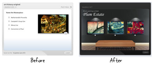
Many rapid elearning developers will use the application’s default background or a pre-built template. That’s a fast way to go, but it doesn’t always work with your content. Instead of a template, try adding a background images that matches the content of your course. It’s a step in the right direction and requires very little effort.
The image above shows a quiz using the default background and one that uses a richer one. That background is a simple stock image and makes a perfect way to show off the art work in a museum.Find the Right Background
Determine to put the learner in a context that matches the content. For example, in our elearning workshop we walk through the Hoh Rainforest design makeover. The goal is to craft a visually immersive experience. What can we do to get the person into the rain forest? For us it starts with finding a rain forest background image and then we add other complementary elements.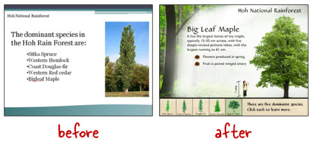
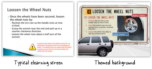
Below is another example. As you can see we took what’s a typical looking slide and converted it to one that has more visual appeal. Since the topic was how to change a tire we went with an automotive theme. Contextually it’s a better fit with the content than the template.
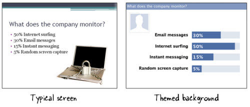
One solution is to find inspiration from other sources. In the example below, the course topic is how an organization monitors Internet usage. Using the Internet to access Facebook at work is very common. So instead of the typical screen, we designed a screen that mimics the Facebook look by using similar colors and lines.
An even easier solution is to settle on a single image background. Think about your course content. What is the one design element that says “this is the topic?” In the Hoh Rainforest demo, we found a single rain forest background image that lets us “step into the rain forest.”
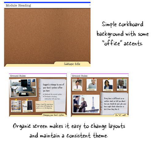
What is the one background image that you can use to bring people into your content? Here are some ideas that are simple and offer flexible layouts. In the corkboard example, the background is the corkboard image.Corkboards typically have paper and notes tacked to them. I like that type of background because it helps build a single visual theme but gives a lot of freedom in how the content can be laid out. You can also do something similar with a desktop or whiteboard.
Below is another example. We’re asking questions about workplace ethics. Instead of the default background that comes with the application, we found a shirt that matches a corporate look. It’s just a simple background image. Nothing fancy. But it really adds some nice texture and interest to the screen.
As you can see, you don’t need to modify the image to create a rich-looking background. The quiz example below is just a picture of a shirt pocket.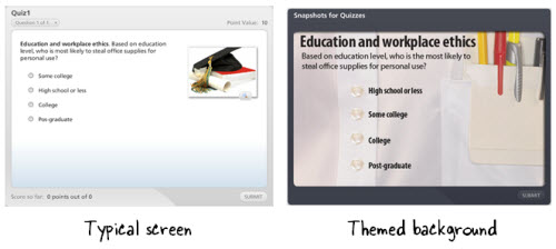
The first step is to determine a single image that represents the essential theme of the content. Then do a search for an image using Microsoft’s site or a stock image site like istockphoto or fotolio.
Here are a couple of ideas for inspiration. I like to look for wallpaper images. They tend to be a little out there, but used the right way can add a nice touch to your courses.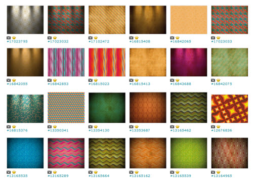
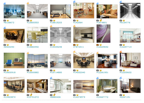
Here’s a link to an idea that probably works better for you. They’re interior images. They’d make great backgrounds for all sorts of elearning courses. You don’t need to buy the expensive images either. I usually get the small versions which just cost a couple of dollars.
Find the one image that represents the essence of your content and then build from there.
TidbitsIf you want to learn more about how to do some of this, sign up for one of the workshops when I’m in your area. The workshops tend to fill up so sign up as soon as you can. I hear the events in the UK are going like hot cakes…or is that crumpets?
I also just added information for the free Articulate jam session while I’m in Jacksonville.
Upcoming Events
- March 21-23: Orlando, FL (Learning Solutions Conference)
- April 5: Portland, OR (OpenSesame). An E-Learning Heroes Roadshow workshop where we’ll look at ways to build elearning courses and learn some great PowerPoint tips. Excellent price and great coffee!
- April 10: Jacksonville, FL (NEFL ASTD). Rapid E-Learning: From Blah to Hoorah! Feel free to contact the chapter if you have questions. Join me for the free Articulate jam session on April 11.
- April 17: Virginia (SEVA ASTD). Rapid elearning workshop. The first half we’ll look at some basic course design and in the second half we’ll learn to build interactive content.
- May 17: Orange County California. Details coming.
- May 22: London, UK. I’m doing a full-day elearning workshop. I’m looking forward to meeting the blog readers in the UK.
- May 24: Leeds UK. This is the annual Articulate users’ conference hosted by Leeds. It’s a great way to connect with other Articulate users.
- October 4: Seattle, WA (ASTDPS). Details coming.
- October 17: Bloomington, IL (CIC-ASTD). Details coming.
Download your free 46-page ebook: The Insider's Guide to Becoming a Rapid E-Learning Pro
No comments:
Post a Comment
Thanks for the comment