A while back I shared an example of how to create more engaging course objectives. It’s a great way to get past the bullet list of learning objectives that we often see in courses. I then did a follow up post on how to quickly find images for your elearning courses. The tips in that post are good, but they set up an issue we commonly run into when building courses.
If you look at the images I recommended and the images I used in the course, you’ll see that I didn’t use the images I recommended. I’ll have to admit, I did that to set up this blog post. Let me explain.

Many aren’t intentional when it comes to the visual design of their elearning courses. They usually start with a nice looking template and then as they build the course they’ll add images that represent the content on the screen.
If they have some design skills it’ll look good. But if not, then they end up with a discordant look where the graphics don’t quite match the content. And most likely the graphics won’t quite match the other graphics either.

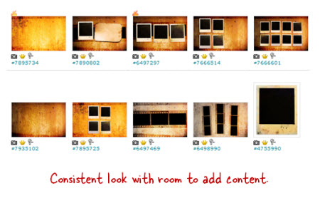
That’s where my earlier tip to find an image pack really works. It lets you get a design for your course that is consistent and polished, and inexpensive.
No Plan Means You Waste Time
But here’s where you may run into some problems. You can waste a lot of time looking for just the right images. But worst of all, you end up letting the images you find drive the course design. That’s not ideal. And that’s kind of what happened to me with my demo.
My initial idea for the demo was beyond my resources, so I decided to look for photo frame pictures on istockphotos. This led me to the Polaroid idea, which then led to the image packs that I wrote about. The image packs worked great because for a few dollars I was able to build a series of rich looking screens for my elearning demo.
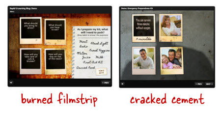
But, when I added more content to the demo I soon realized that the images (which were made up of burned filmstrips) just didn’t look right with the earthquake content. The look was rich but it didn’t match the earthquake content and seemed out of place.
How to Craft a Visually Immersive Experience
Elearning courses are mostly visual. When you build a course you have to have the right visual look to match your content. I like to think of it as creating a visually immersive experience where you’re trying to place the learner in the same space as the content.
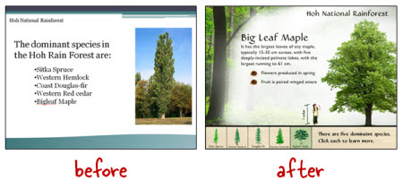
For example, in our workshops we use this demo of the Hoh Rain Forest. The goal is to place the learner in the rain forest so we walk through the process of converting a simple PowerPoint slide to something more immersive.

Going back to the burned filmstrip images, they didn’t work for an earthquake course. When I think earthquake, I think more about damaged buildings. So what I did was swap the burned filmstrip background with a cracked cement image. It works better for the earthquake theme and content.
Visual Design Tips
Here are some quick tips to help build your next course.
- Find inspiration. Going through stock image and template sites is a good way to come up with design ideas. Perhaps you’ll discover a new way to layout your screen elements. Or maybe you’ll find a cool color scheme. Make time to find inspiration. I keep a notebook of links and ideas so when I need something I can look through it for ideas.
- Plan your visual design. Looking for inspiration is something you do outside of the course design. It’s an ongoing discipline. But when you start to build your elearning course, you need to be intentional about the design. It’s not something you do on the fly. Otherwise you waste time and probably won’t end up with the best looking course.
- Image packs from the same artist or style can save time and money. Just like I mentioned in the earlier post, finding image packs will help when it comes to the overall look of your course. But don’t let them drive the design process. Decide what you need before looking for images.
- Create an immersive visual design. Put the learner where the course will be. In the Hoh Rain Forest demo, the goal is to place them in the forest. If you’re building a course on operating room technology, how will that look compared to one on office policies? And how’s that different than teaching something about warehouse safety? Your visual voice speaks to you and forms a mental image consistent with the course topic. Learn to tap into that voice and you can build a look that matches your content.
- Keep it simple. Since most of us aren’t graphic designers it helps to have a few simple rules to keep us from creating a mess. At a minimum find the right type of background that lets you craft a visually immersive screen. Just changing a background can do wonders. Then limit yourself to two fonts. One for the titles and one for the body. Determine your color palette before you start building. You probably only need three or four. Determine how you’ll use them and then be consistent throughout the course. A few simple rules applied with intention go a long way.
There’s a lot more to the visual design process. We actually go into it quite a bit in the workshops I do. I have those listed below. The main point is that before looking for images, determine what you want to find. Otherwise you’ll end up wasting time or letting the pictures you find dictate your course design rather than the content doing that.
Do you have some simple graphic design tips you can share for the elearning developer who’s just getting started? Share them by clicking on the comments link.
TIDBITS
February 22-23: St. Louis (ASTD). February 22: Rapid E-Learning Workshop and February 23: PowerPoint Doesn’t Have to Be Boring. We’ll follow the presentation with a free Articulate jam session.
March 21-23: Orlando, FL (Learning Solutions Conference)
April 10: Jacksonville, FL (NEFL ASTD). Details coming. Feel free to contact the chapter if you have questions.
April 17: Virginia (SEVA ASTD). Rapid elearning workshop. The first half we’ll look at some basic course design and in the second half we’ll learn to build interactive content.
April 5: Portland, OR (OpenSesame). An E-Learning Heroes Roadshow workshop where we’ll look at ways to build elearning courses and learn some great PowerPoint tips. Excellent price and great coffee!
May 17: Orange County California. Details coming.
May 22: London, UK. I’m doing a full-day elearning workshop. I’m looking forward to meeting the blog readers in the UK.
May 24: Leeds UK. This is the annual Articulate users’ conference hosted by Leeds. It’s a great way to connect with other Articulate users.
October 4: Seattle, WA (ASTDPS). Details coming.
October 17: Bloomington, IL (CIC-ASTD). Details coming.
I had some questions about the difference between the two sessions I’m doing in the UK. The London workshop covers general elearning and the Leeds session is focused on Articulate.
Now’s a good time to sign up for the workshops in Virginia and Oregon before they sell out.
Upcoming Events
Download your free 46-page ebook: The Insider's Guide to Becoming a Rapid E-Learning Pro
No comments:
Post a Comment
Thanks for the comment