
There are three core questions that help guide the development of an elearning course. I discussed this a bit in the post on building a roadmap for elearning.
- What is the look and feel of the course?
- What information needs to be in the course?
- What will the learner do with the information?
For many rapid elearning developers the most challenging part is the first question because it requires a skill set different than training or instructional design. So what typically happens is that we create elearning courses that either all look the same or have a discordant look where the images and typography are a hodgepodge of whatever we have available.
In today’s post I’ll share a simple way to get a nice look for your course that will give it a rich feel. It’s not a substitute for good instructional design, but it is a simple way to make your course look good and take the pressure off of the rapid elearning developer who has limited access to graphic designers.
In a recent post I shared some ideas on how to craft more engaging objectives. For the demo, I wanted my earthquake intro to feature a family huddled in the dark. And as the information was shared a family member would disappear.
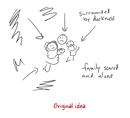
Like most of you, I am pressed for time. Since I had no time to build the graphics I wanted, I decided to change the huddled family image to a framed photo of a family. This would be a lot easier to do since all I needed was an image of a picture frame and a family.
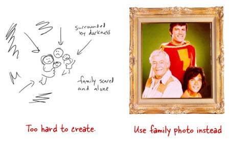
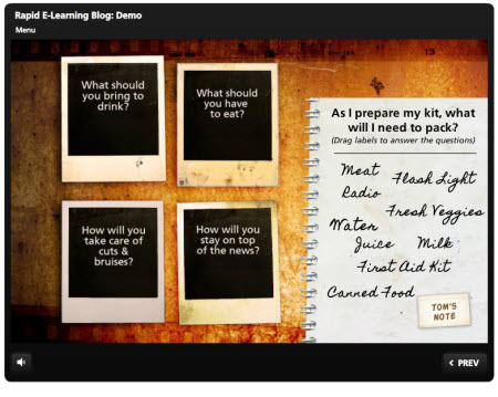
As I was looking for picture frames on iStockphoto I saw a few Polaroid-like images. So I decided to switch from a single picture frame to Polaroid photos of each family member. Doing a search for “Polaroid” revealed a lot of cool layouts. What I like about them is that they offer some structure that I could easily use in my elearning course.
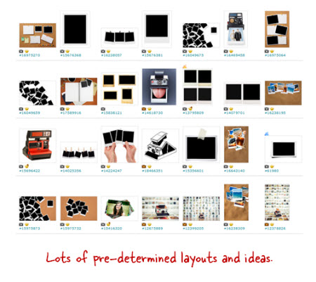
Searching through the Polaroid images lead me to an artist who had a series of images that I could use. The artist provided a background, title and section screens, and then various layout options. The added bonus is that since they came from the same artist they all looked like they belonged together.
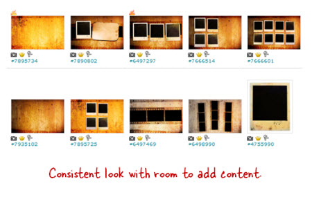
Here’s a quick demo of these images used in an elearning course. As you can see, I didn’t have to do much work because I used the default layouts for my slide backgrounds.
I look for images that come from the same style so I can get a consistent look and avoid a discordant style. And then I look for “buckets” where I can add content. In this case the Polaroid images are perfect. I can use them to add pictures, as menu choices, or even as a way to display text that may have previously been a bullet point.
The secret is to find an artist who provides a lot of images that come from the same style. This way you have a lot to work with. Here are a few sets that I think would work well in an elearning course:
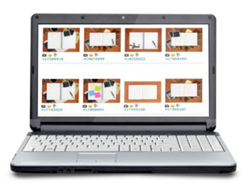
- Grungy Photos (set used in this demo)
- Education theme
Desktop themes (same artist):
This isn’t a replacement for good instructional design. You’ll still need to do that. But for the elearning developer who has no graphic design background and wants to create a visually appealing course, it’s an easy and simple solution.
Are there any similar styles in the stock image sites that you like? Feel free to share them in the comments link.
Tidbits:
I’ll be in St. Louis for two days; make sure to check out the sessions below. I’m also thinking about doing some workshops in Australia in August. If you’re interested, let me know.
Upcoming Events
- January 11: Training Magazine (free webinar): Learn to Use PowerPoint for More Than Boring Presentations.
- January 17: eLearning Guild (webinar): The Secrets to Rapid eLearning Success
- January 25-27: Las Vegas (ASTD TechKnowledge 2012).
- February 13-14: Atlanta (Training Magazine). I’ll be doing a session on PowerPoint and we’ll have two Build-A-Course sessions. Details coming.
- February 22-23: St. Louis (ASTD).
- 22: Rapid E-Learning Workshop. This is a great deal for a full-day workshop that also includes a full breakfast and lunch.
- 23: PowerPoint Doesn’t Have to Be Boring. Will follow the presentation with a free Articulate jam session.
- March 21-23: Orlando, FL (Learning Solutions Conference)
- March: Knoxville, TN (Smokey Mountain ASTD)
- April 10: Jacksonville, FL (ASTD). Details coming.
- April: Virginia (SEVA ASTD). Details coming.
- May 17: Orange County California. Details coming.
- May 21-25: Somewhere in the UK. Details coming.
- August: Australia…would be great. Let me know if you’re interested.
Download your free 46-page ebook: The Insider's Guide to Becoming a Rapid E-Learning Pro
No comments:
Post a Comment
Thanks for the comment